Rescue.co
Designing brand Systems for East-Africa’s largest first responder network
Overview
Rescue.co established its reputation as the 911 of Africa and East Africa's largest first responder network, earning profound trust across the continent. When the organization moved to offer B2C services such as Roadside and Safe Travels, it needed a way to manage this expansion without weakening its central presence.
Working with a company of this scale presented a clear challenge: how to move beyond designing individual service features and instead build a scalable multi-brand architecture and design system.
I set out to establish precise taxonomy, governance frameworks, and operational order across a massive footprint, creating a unified ecosystem that secures future growth while protecting the core authority of the parent brand.
- Product & Brand Systems Designer
- Brand Strategy
- Brand Architecture
- Visual Systems
- Digital Design
- Print Design
- Production Design
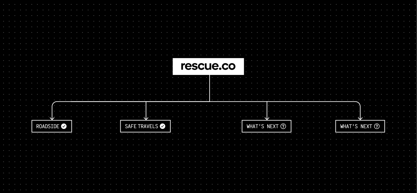
Understanding the system
My approach was to look at the organisation as a whole. I mapped how the brand moved across every touchpoint, from digital products and marketing websites to emergency vehicles, printed materials, physical spaces, partnerships and future service launches.
The goal was to understand how new offerings could integrate into the existing brand without creating fragmentation. Through this process, it became clear that the challenge wasn't the design of individual identities. The organisation lacked a clear framework for governing how new services should relate to the Rescue.co brand.
Without shared principles, every expansion risked introducing new inconsistencies. The priority, therefore, wasn't to create more brand assets but to establish the system that would guide them.
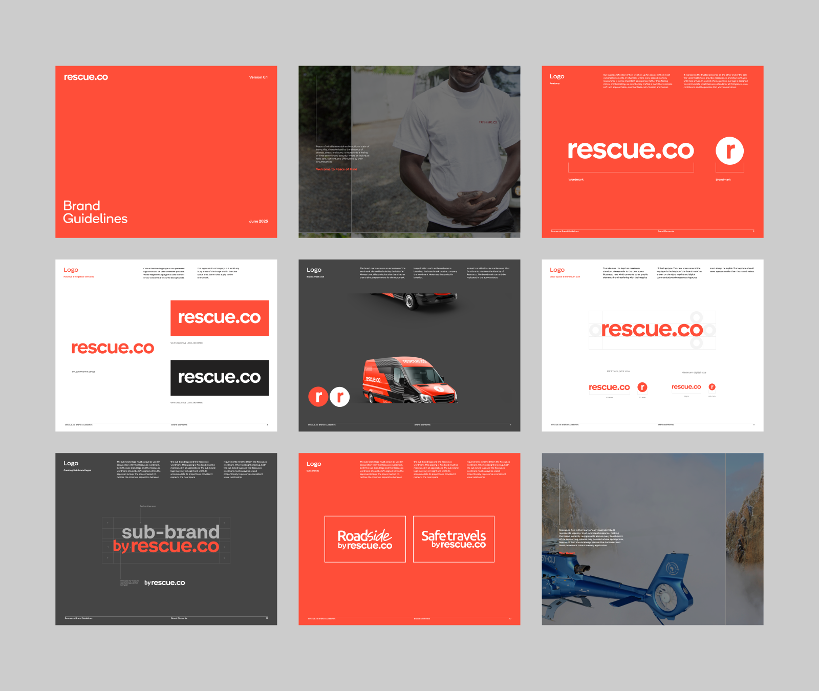
Building the system
Over the following year, I worked closely with the Rescue.co team to establish the foundations for the company's continued growth. Together, we created a scalable brand system with clear standards for:
- Brand architecture
- Product and sub-brand naming
- Scalable identity systems
- Comprehensive brand guidelines
- Production standards
Standardising the brand
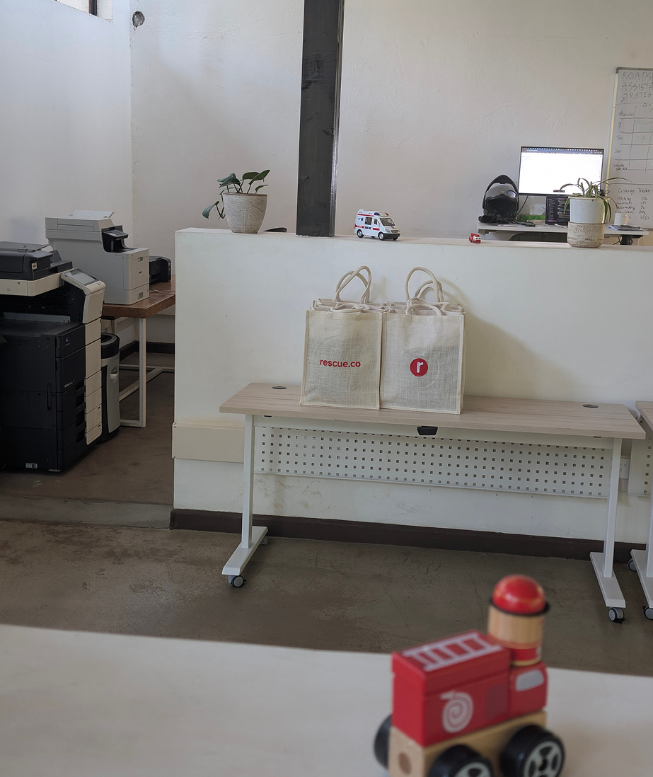
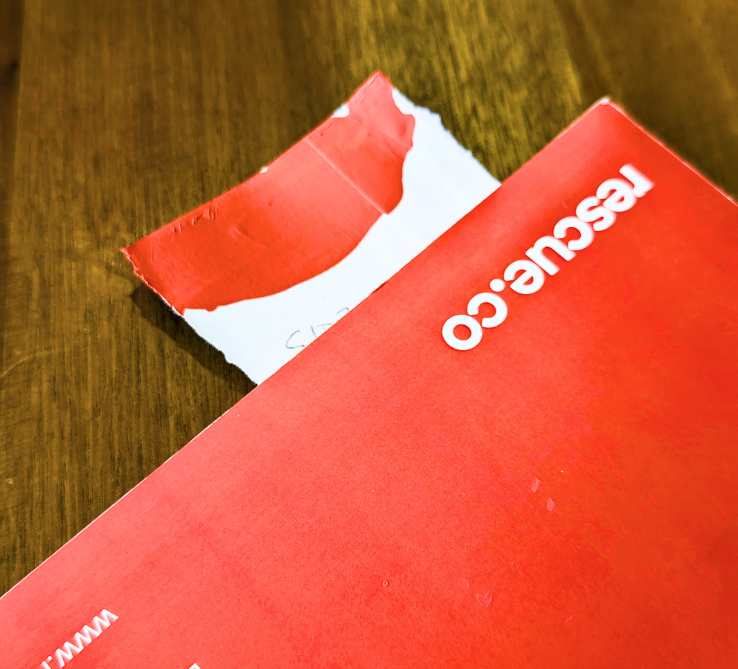
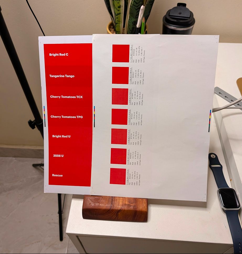
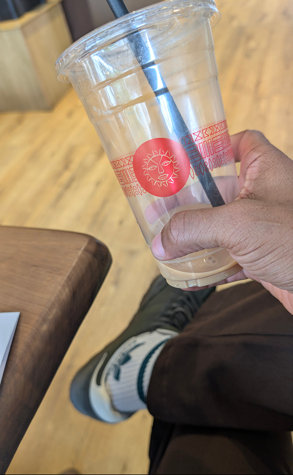
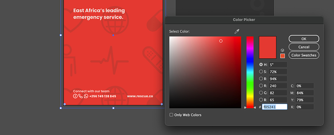
One of Rescue.co's strongest visual assets was its signature red. Ironically, it was also one of its biggest inconsistencies. The same brand appeared differently across websites, brochures, vehicles, signage and physical spaces because there was no standard for reproducing the colour outside digital products.
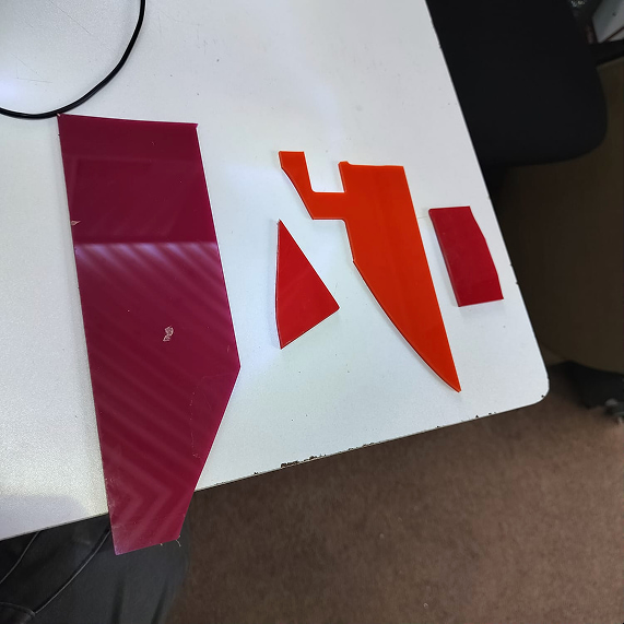
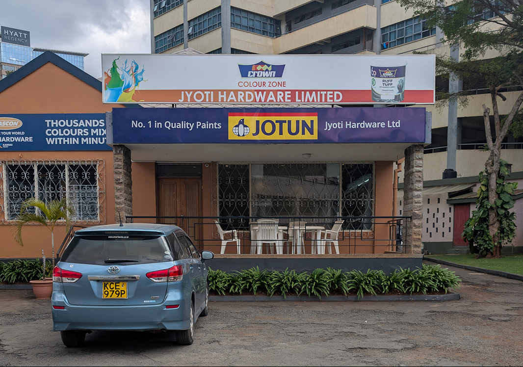
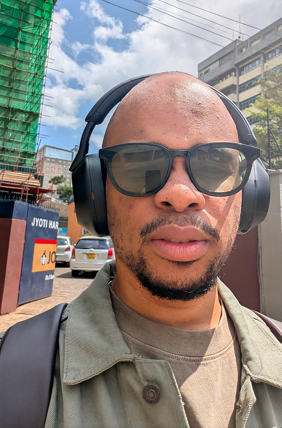
Rather than treating colour as a design decision, I approached it as a production problem. I partnered with JYOTI Hardware, we moved beyond digital screens to find the exact tactile realization of the brand's core red.
This phase involved testing the signature pigment across various industrial substrates, from matte powder coated metal surfaces for vehicle wraps and spatial installations to high fidelity print stocks. The goal was to ensure the hue remained consistent, vibrant, and authoritative across every physical touchpoint.
Confidence, not crisis
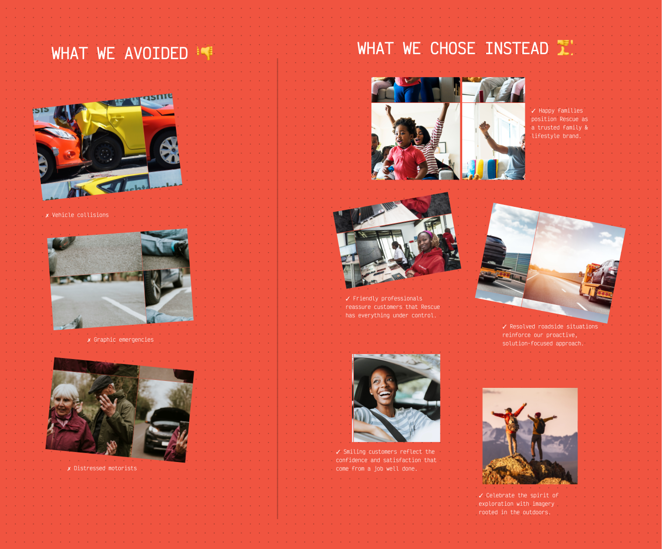
The way emergency services are typically portrayed presented an opportunity to differentiate the Rescue.co brand. Most competitors relied on imagery of accidents, distressed motorists and moments of panic to communicate urgency. While effective at capturing attention, this approach positioned the brand around the problem rather than the outcome.
My strategy took a different direction.
I defined Rescue.co as a solution-first brand, one that represents confidence, reassurance and preparedness rather than fear. Instead of showing emergencies, we showed what happens after help arrives.
Our imagery focused on calm interactions, capable responders and people continuing their journeys with confidence, reinforcing the feeling that Rescue.co isn't simply there to respond to emergencies. It's there to remove uncertainty before, during and after every journey.
This visual strategy became a defining principle across websites, social campaigns and future marketing communications, giving the brand a more optimistic and differentiated voice within the category.
Beyond the screen
A design system only succeeds when it works everywhere.
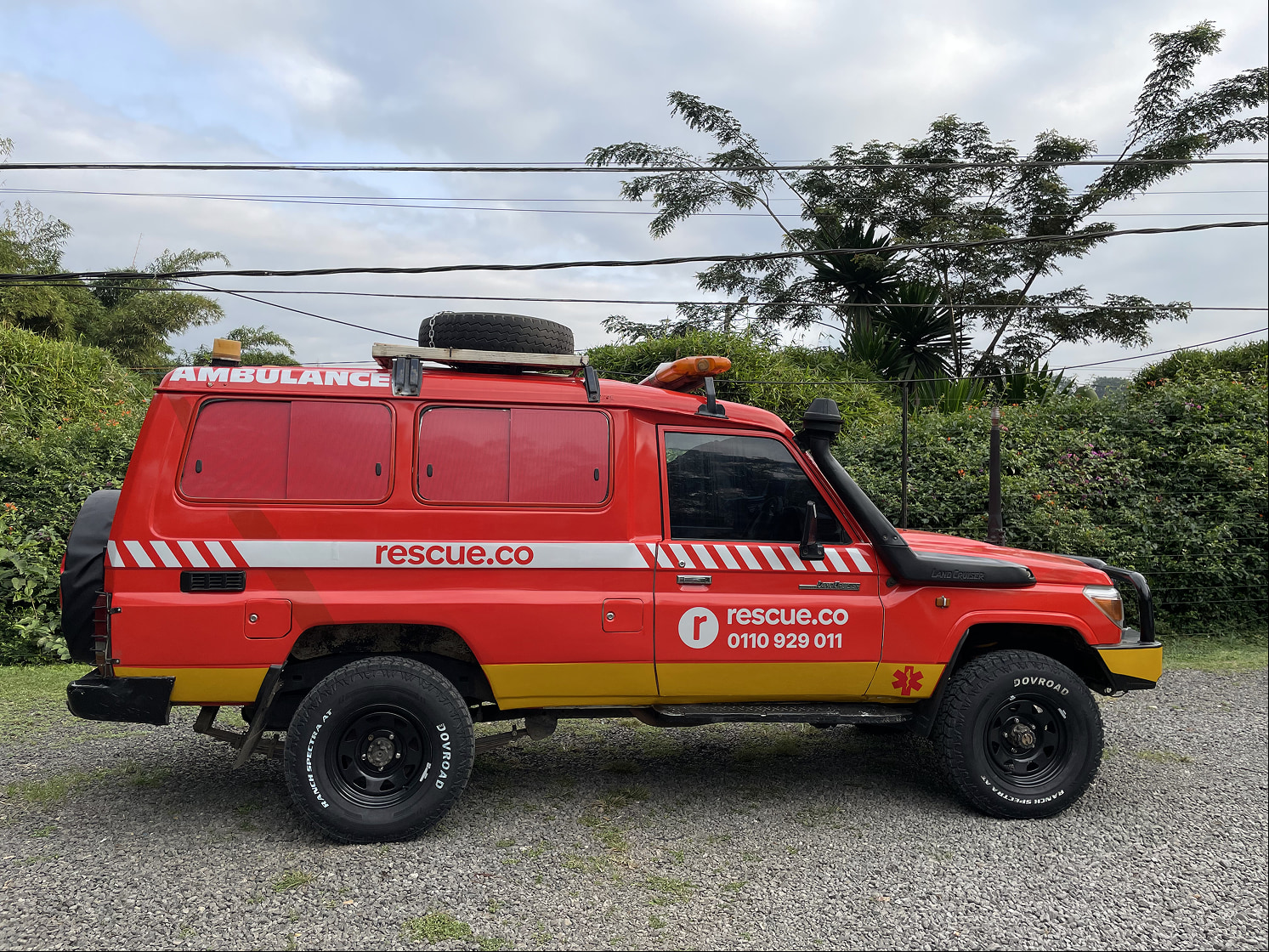
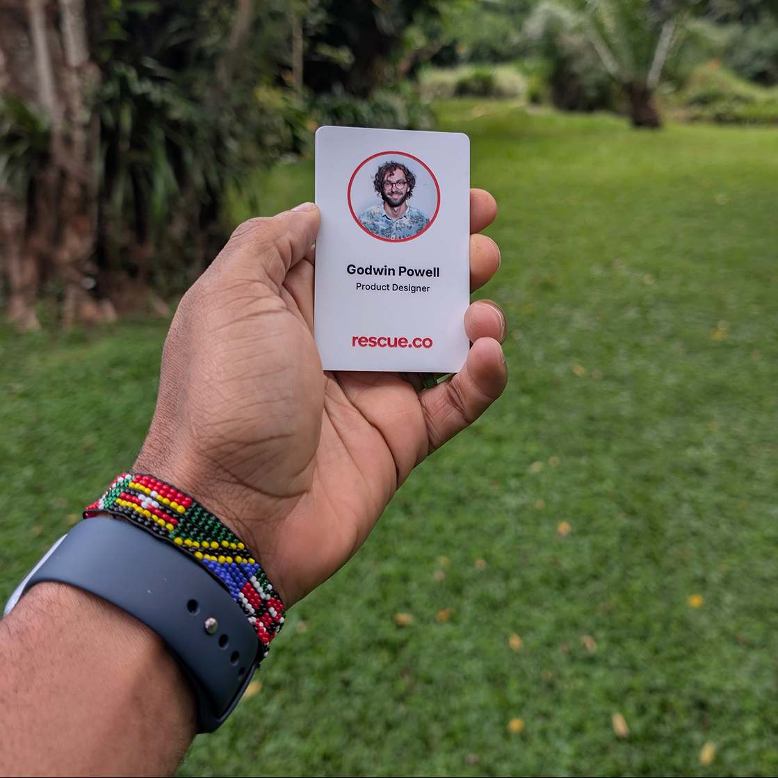
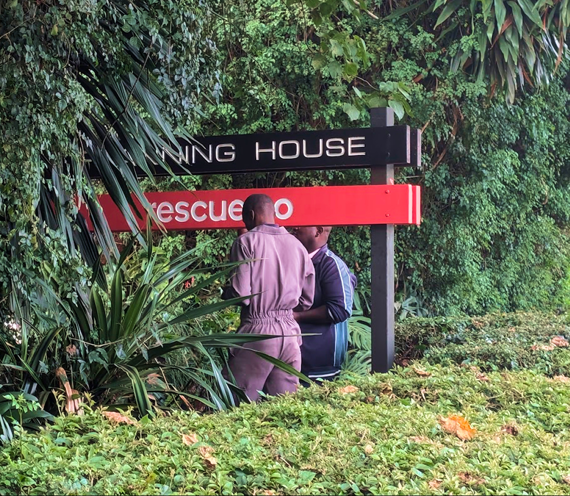
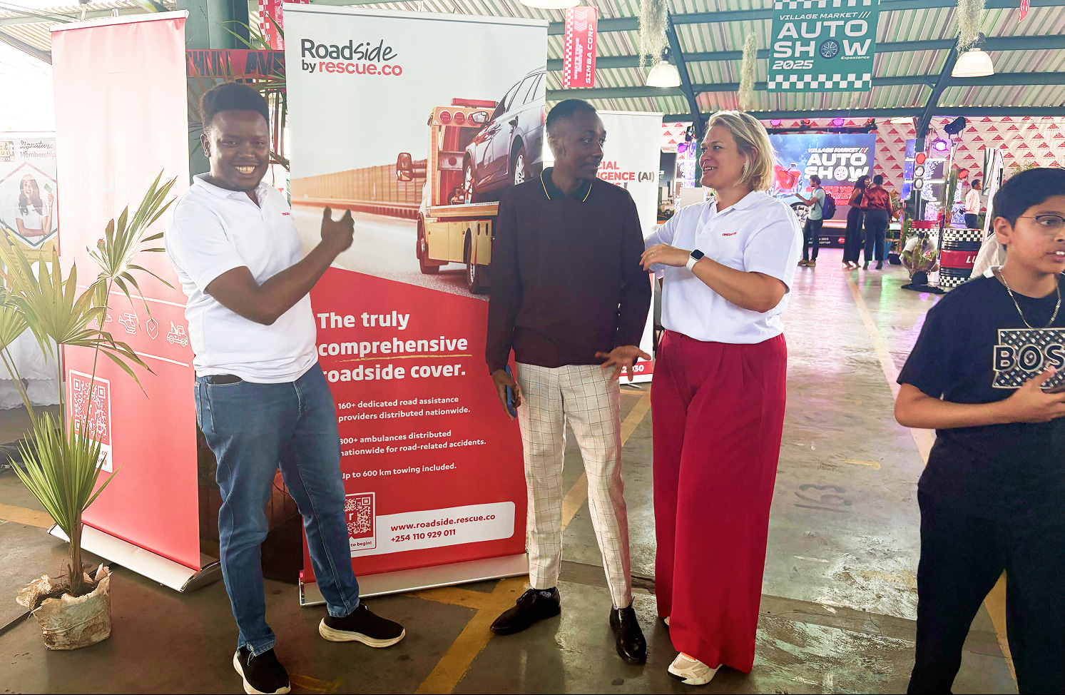
Following the colour standardisation and brand guidelines, the new system was rolled out across multiple customer touchpoints, from printed materials to emergency vehicles and physical environments. Instead of creating isolated assets, I focused on ensuring every interaction reinforced the same brand experience.
Bringing it online
Same principles that guided the physical rollout also shaped the digital experience.
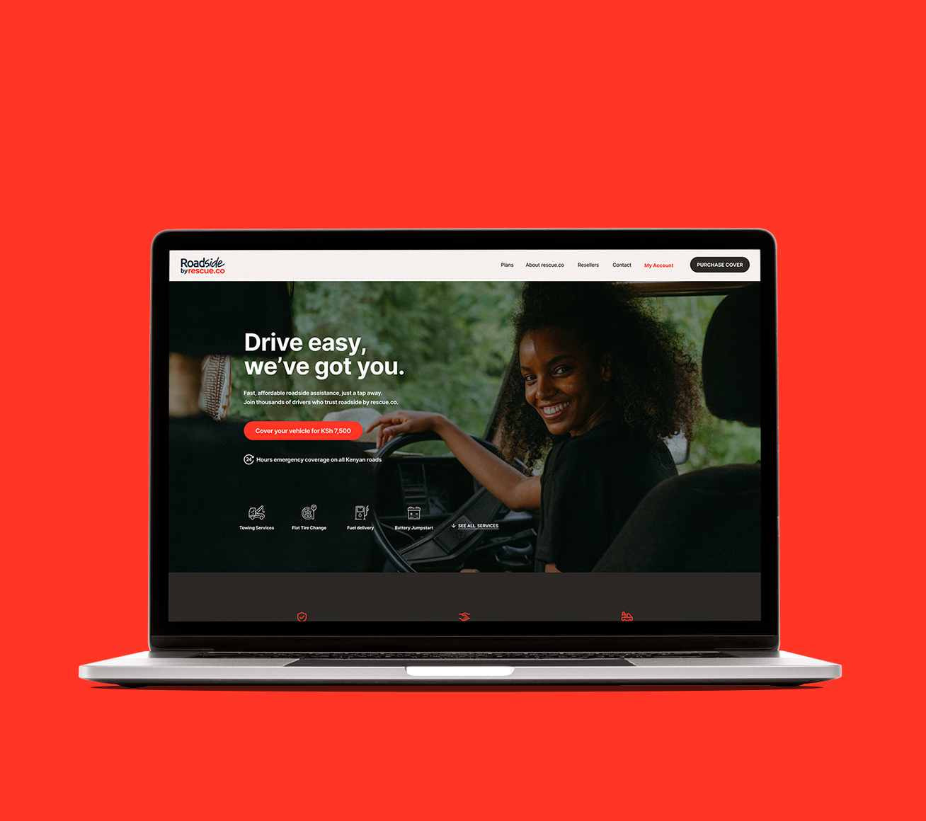
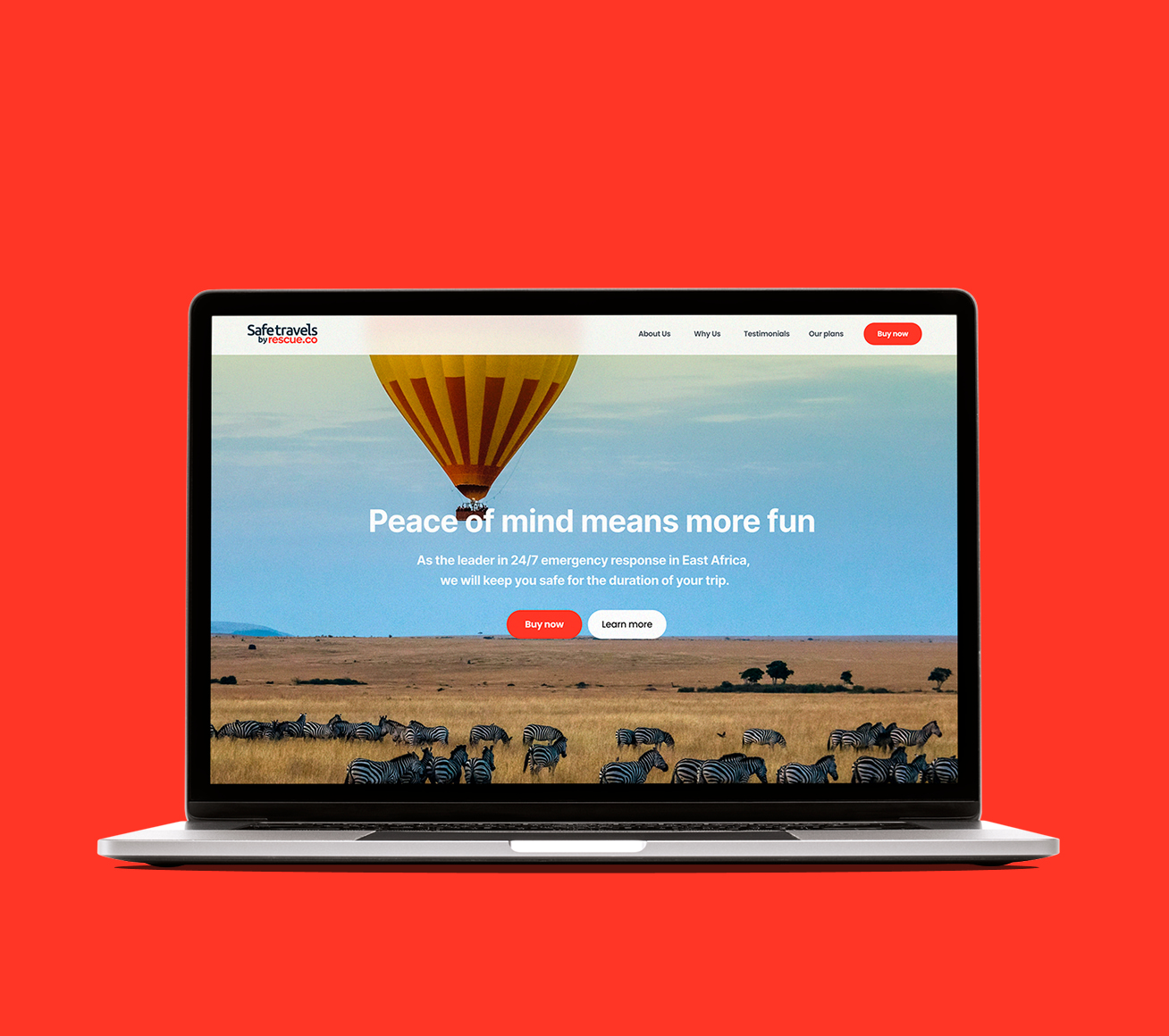
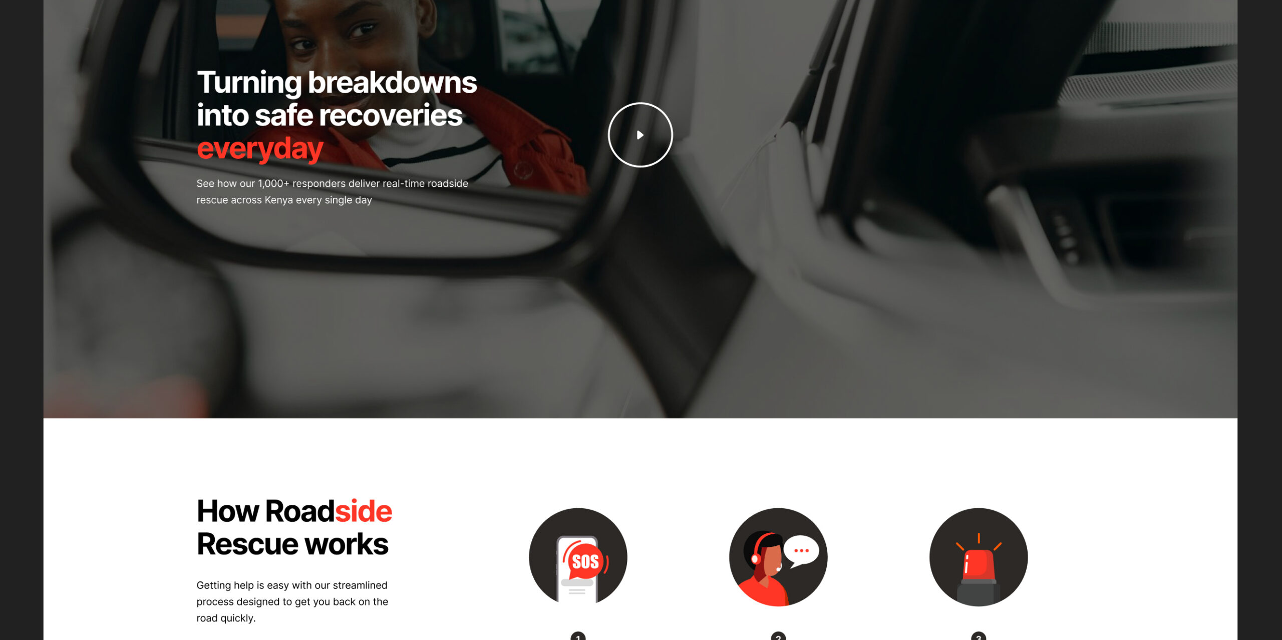
I designed dedicated marketing websites for both Roadside and Safe Travels while ensuring they felt unmistakably connected to Rescue.co. Although each service addressed a different customer need, they all belonged to the same ecosystem.
This consistency made it easier for customers to understand new offerings while strengthening recognition of the parent brand.
A scalable system
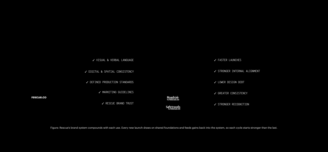
The most valuable outcome wasn't the launch of two new services. It was creating a repeatable system that could support every service Rescue.co builds in the future.
Instead of designing brands one at a time, the organisation now has a framework for expanding consistently across digital products, marketing, partnerships and physical environments.
Outlast the project
One of the most rewarding outcomes wasn't what we launched during my time at Rescue.co, it was the foundation I left behind.
Today, the systems established during this project continue to support the organisation as it expands into new markets, grows its fleet, launches campaigns and introduces new services. Internal teams and external marketing agencies now have a clear set of principles to build upon, allowing the brand to evolve with greater speed, consistency and confidence.
Outcomes

Scalable Fleet System
A repeatable vehicle branding framework ensures every new ambulance strengthens the Rescue.co brand.

Scalable Production System
Documented colour and production standards help local vendors reproduce the brand consistently as Rescue.co expands across Africa.

Faster Marketing Execution
Reusable templates reduce production time while improving consistency across campaigns, reducing production from weeks to hours.

Partnership Framework
Standardized guidelines and brand rules streamline collaboration, enabling partners to launch new services faster—from concept to deployment in hours.
Get in touch
Check out my digital portfolio slide here
The text, graphic and case-studies belong to Okhaide Ajayi and cannot be used by other individuals without permission and without giving credit.
© Okhaide 2026